Scroll down to learn more.
About
In order for an organization to succeed, it needs to foster deep and meaningful customer relationships, be agile and free to take advantage of opportunities and have everyone aligned as they step forward. Suissa uses design to help you understand your own and your customers needs better, develop multitudes of innovative solutions for solving the problems we uncover and help you to prototype new offerings in more efficient ways.
Companies that organize
around customer experience
transform markets.
Suissa works alongside visionary leaders to establish an environment and processes that foster creativity and lead to more innovative solutions that solve their own and their customers needs for years to come.
Services
We create and execute design
solutions for problems of
form, usability, ergonomics,
and manufacture.
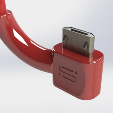
First and foremost Suissa is an industrial design studio. Taking you from invention to innovation to market understanding to prototype to production, Suissa has the skills and expertise to provide you with what you need to create your product vision.
We design products, processes,
services, and environments with
a focus on the quality of the user
experience.
It is all about the user experience. At Suissa, every project begins with a discussion about the minimum viable experience. Our services include market research, focus groups, user interviews, usability and experience testing, interface design and graphics design.
Design direction for business.
Get your business on the next level.
Whether you are in the early stages of product ideation or preparing to scale up production, Suissa Design can help you to explore aspects of your project in ways you never thought.
We bridge the gap between
the virtual and the physical.
As your products and services rely more and more on integrated physical and virtual solutions, Suissa Design has excelled in offering design of interfaces that work towards a seamless User Experience.
Professional design management.
Get your business on the next level.
Learn to integrate design into your business.
Suissa design can help you to manage your design project from concept to production. Whether you utilize our expertise or augment your in house professionals with our skills, we can help you to realize solutions that will excite your users and have the best chance of being fiscally viable.
Suissa Design provides you with the foundation for not only managing your product development, but also integrating it into your business mindset so “being more like Apple” isn’t just a catch phrase but rather an actionable statement.
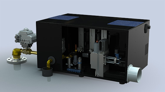
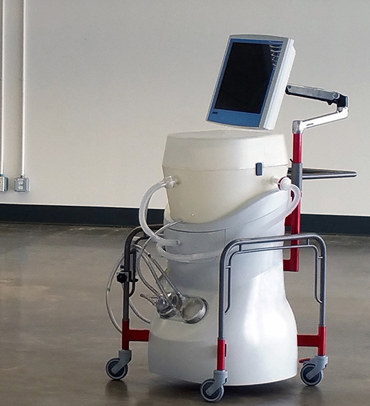
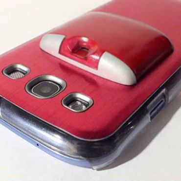
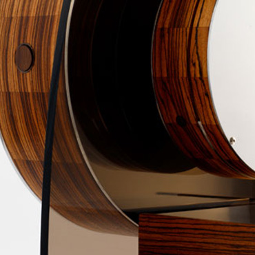
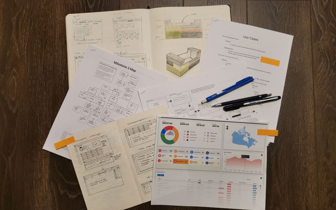
Our Work


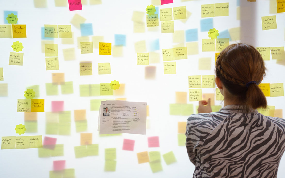
Our Process
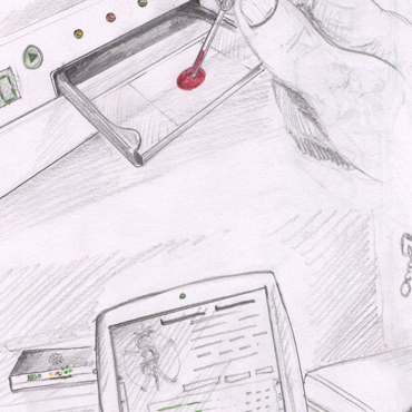
1. Inspiration
Design is not a process that is linear, and it is certainly not a clean process. We like playing in the mud and discovering the diamonds.
2. Ideation
I like to think of the design tools for ideation as a mindset that focuses on how to look at challenges around us.
3. Implementation
Methodologies and processes are important, but these are mere tools. We plan for implementation right from the beginning.